-
Resources
-
Pricing
The History of Typography traces how societies have designed, reproduced, and used written language, from early inscriptions and manuscripts to printing presses, modern typefaces, and digital text. More Less
Build a timeline like this one in minutes, for free. Start Yours →
1400
In the early 15th century, Italian scribes and humanist scholars searched for ancient lowercase letters to pair with Roman inscriptional capitals, helping inspire the humanist tradition of roman typography.
Image source: Humanist minuscule
1468
Around 1468 in Rome, Arnold Pannartz and Konrad Sweynheim used a typeface closely modeled on humanistic minuscule. This design became known as Lactantius.
Image source: Arnold Pannartz and Konrad Sweynheim
1470
Nicolas Jenson began printing in Venice in 1470 with an original roman font that became one of the foundational models for Western text typography.
Image source: Nicolas Jenson
1472
Some time before 1472 in Venice, Johann and Wendelin issued material in Gotico-antiqua, a hybrid type combining half-Gothic and half-Roman characteristics.
1486
Around 1486, Erhard Ratdolt produced a half-Gothic Rotunda typeface designed to suit Venetian taste.
Image source: Erhard Ratdolt
1491 - 1519
Johann Froben established his press in Basel in 1491. By about 1519, when he printed Erasmus's famous Greek New Testament edition, he had set humanistic printing standards widely copied across German-speaking regions, Spain, and parts of England.
1499
The Aldino italic type, commissioned by Aldus Manutius and cut by Francesco Griffo in 1499, was a closely spaced, condensed design.
Image source: Aldine Press
1500
Soon after 1500, roman typefaces began gaining popularity north of the Alps, particularly for printing Latin literature.
Image source: Roman type
1527
Around 1527, Vatican chancellery scribe Ludovico Arrighi designed a superior italic type whose punches were cut by Lauticio di Bartolomeo dei Rotelli.
1527
The political and economic turmoil surrounding the sack of Rome in 1527 brought Venetian pre-eminence in type design to an end.
Image source: Sack of Rome (1527)
1550
By the middle of the 16th century, italic type became less popular for continuous text and was increasingly reserved for citations, block quotations, preliminary text, emphasis, and abbreviations.
Image source: Italic type
1426
According to a tradition from Feltre and Lombardy, the Italian engraver Panfilo Castaldi saw Chinese books brought by Marco Polo, adopted wooden movable type, and printed several broadsides at Venice in 1426.
1450
Around 1450, Johannes Gutenberg invented a lead type mold, applied it to an alphabet of about 24 characters, and used existing press technology to print ink on paper. This development established the foundation of Western typography.
Image source: Johannes Gutenberg
1450
No texts indicate knowledge of Chinese movable type in Europe before 1450, and no archaeological evidence of Asian movable type has been found west of Dunhuang and Turfan from before that date.
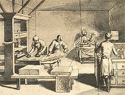
Image source: History of printing
1450
The handwritten letterforms of mid-15th-century calligraphy provided the natural models for the first systematized typographic letterforms.
Image source: Typography
1450
Typography, type-founding, and typeface design emerged as closely related crafts in mid-15th-century Europe with the introduction of movable type printing at the transition from the medieval era to the Renaissance.
1455
A second typeface of about 300 characters designed for the 42-line Bible around 1455 was probably cut by the goldsmith Hans Dunne with assistance from Götz von Shlettstadt and Hans von Speyer.
Image source: Gutenberg Bible
1473
Valencia in the Kingdom of Aragon became the location of the first press in the region, established in 1473.
1474
Johann Bämler's Schwabacher type appeared at Augsburg in 1474, contributing to the development of German Gothic typography.
1476
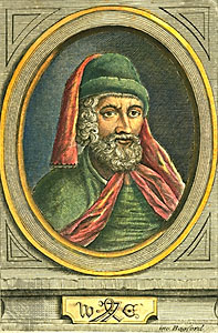
In 1476 William Caxton, having learned printing on the Continent, printed the first books in England using a Bâtarde type, an early Schwabacher design that he soon abandoned.
Image source: William Caxton
1495
Printing in Portuguese began at Lisbon in 1495. The first book printed in Portugal, however, was a Hebrew book produced in 1489.
1599
Guido Panciroli disputed the theory that European movable type originated in China, noting the absence of textual evidence for Asian movable type in Europe before 1450.
1716
John Bagford argued that European printers were more likely inspired by Ancient Roman medals, seals, marks, or names on sacrificial pots than by Chinese printing, because knowledge of the Chinese was limited in the past.
1843
Robert Curzon recorded the tradition that Castaldi introduced movable type to Europe, citing a news article written by a doctor from Feltre in 1843.
1871
Henry Yule, the translator of Marco Polo's works, viewed the Castaldi story skeptically while allowing that Chinese wood blocks might have reached Europe through travelers.
1470 - 1500
Gothic types dominated French printing until the end of the 15th century, when roman designs gradually supplanted them.
1470
German printers Martin Crantz, Michael Freyburger, and Ulrich Gering introduced typography to France by establishing a press in Paris in 1470, where they printed with an inferior copy of the Lactantius type.
1494
After the French invasion of Italy in 1494, French printers and designers were strongly influenced by Renaissance culture and began converting French typography from Gothic toward neoclassical forms.
Image source: French Renaissance
1500 - 1599
During the 16th century, Western printers developed Oriental types, including designs associated with François Savary de Brèves and Robert Granjon, generally to support Catholic proselytizing.
1503
Jodocus Badius Ascensius, known as Josse Bade, established a Paris press in partnership with Henri Estienne in 1503.
1531
The de Colines roman of 1531 resembled Francesco Griffo's 1499 roman without closely copying it, becoming part of the influential French typographic tradition.
1532
Robert Estienne's roman of 1532 resembled the de Colines face and was paired with a fine italic based on Arrighi's model.
Image source: Robert Estienne
1532
In 1532 Antoine Augereau cut punches for a roman type very close to Estienne's. Their lowercase forms became foundations of post-Renaissance old-style typography and were copied by French typographers for roughly 150 years.
1541
In 1541 Robert Estienne, printer to the king, helped Claude Garamond obtain commissions to cut Greek fonts for King Francis I. The resulting designs were known as the grecs du roi.
Image source: Claude Garamond
1550 - 1599
Robert Granjon worked mainly at Lyon during the second half of the 16th century and was also recorded at Paris, Rome, and Antwerp. His work remained a major influence on italic design until the Arrighi model was revived in 1920.
1550 - 1600
After about 1550, the Swiss and German typographic tradition was gradually overwhelmed by French influence.
1592
A specimen sheet issued by the Egenolff-Berner foundry in 1592 showed the types called Canon de Garamond and Petit Canon de Garamond, generally accepted as Claude Garamond's final roman types.
1618
Around 1618, the Dutch Elzevir firm in Leiden used roman types that reiterated the 16th-century French style with higher contrast, less rigor, and a lighter page effect.
Image source: House of Elzevir
1647
After 1647, most Elzevir faces were cut by Christoffel van Dyck. His precise renditions were considered by some contemporaries to be finer than Garamond's.
1670 - 1672
Because Crown interference restricted English type founding, Bishop John Fell purchased punches and matrices from Holland around 1670–1672 for the Oxford University Press. The resulting Fell capitals anticipated later modern roman characteristics.
1734
The gun engraver turned punchcutter William Caslon spent 14 years creating the typeface collection shown on his 1734 specimen sheet. His designs became highly influential in Britain and the American colonies.
Image source: William Caslon
1742
Pierre Simon Fournier's rococo-influenced designs, including Fournier and Narcissus, and his 1742 Modèles des Caractères adapted the Romain du Roi tradition. He called high-contrast faces such as those of Fell, Caslon, and Fleischmann modern.
Image source: Pierre Simon Fournier
1743
Joan Michaël Fleischmann, a Nürnberg-trained punchcutter who settled in Holland around 1728, produced a distinguished roman design after 1743. It related to earlier transitional types while departing from them.
1750 - 1800
Caslon's type, introduced by Benjamin Franklin, became dominant in the thirteen American colonies during the second half of the 18th century and was used for the United States Declaration of Independence.
1751
About 1751, John Baskerville moved into printing after finding financial success producing goods from sheet metal. His work strongly influenced later English type design.
1786
Around 1786, William Martin, who had been apprenticed to John Baskerville, cut modern romans for printer William Bulmer. These designs resembled the high-contrast styles associated with Bodoni.
1800 - 1820
Modern romans emerged around 1800 and became totally dominant by the 1820s. In Britain and the United States, they generally took a rounder, less geometric form than the designs of Didot and Bodoni.
1800 - 1845
Egyptienne fonts appeared at the beginning of the 19th century. Slab-serif designs, including Clarendon from 1845, strengthened serifs to help prevent damage during newspaper printing.
1820
By about 1820, most Western countries were using modern romans and italics for continuous texts, while old-style faces remained popular until about 1910.
1886
Ottmar Mergenthaler's invention of the Linotype machine in 1886 introduced hot-metal composition and became one of the defining technical developments in modern typography.
Image source: Linotype machine
1887
Tolbert Lanston's Monotype machine, developed in 1887, provided another major hot-metal typesetting system. The contrasting Linotype and Monotype approaches shaped 20th-century typographic development.
1890 - 1900
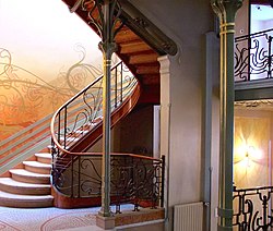
Around 1890, Art Nouveau became popular. Its floral ornaments, curved forms, and emphasis on graphic realization inspired type designers at the beginning of the 20th century.
Image source: Art Nouveau
1890
The establishment of photography at the end of the 19th century led to the first halftoning and reproduction procedures, changing typography from a straightforward craft into a challenge of industrial mass society.
1900
Around the start of the 20th century, typography saw a stronger return to the roots of book art, responding to industrial production with renewed attention to historical craft and page design.
Image source: Arts and Crafts movement
1900 - 1924
The principal development centers of avant-garde typography included Budapest, Zagreb, and Belgrade, with Prague becoming important after 1924.
Image source: Avant-garde
1924
In 1924, Ljubomir Micić organized the First International Zenitistic Exhibition of New Art in Belgrade, one of two exhibitions identified as important to avant-garde typography.
1924
In 1924, Ion Vinea and Marcel Iancu organized the First International Exhibition Contimporanul, contributing to the development of avant-garde typography.
1925
From 1925, avant-garde typography spread to cities across Western and Eastern Europe, reducing the earlier prominence of Budapest, Zagreb, Belgrade, and other initial centers.
Build a timeline like this one in minutes, for free. Start Yours →
Or browse the full history timeline directory, with more than 2,500 topics.
This History of Typography timeline was generated with the help of AI, using information found on the internet.
We work hard to keep these timelines accurate, but mistakes do get through. If you spot one, email us at [email protected] and we'll fix it for future visitors.
Generate yours with AI or build it from scratch, for free.
Export your timeline, add your own events, edit or remove AI-generated events, and much more
No credit card required.
15-day money-back guarantee.
You can create an unlimited number of timelines with up to 10 events on each one, customize how they look, export them to PDF, PNG, PowerPoint, CSV, and Excel, and share them with a link. Timelines made with Timeline Maker AI keep every event the generator created, and you can add up to 5 events of your own. Paid plans remove the event limit, add spreadsheet imports and hide Preceden's branding, and the higher-priced plan also adds collaborators, a custom logo and a custom domain.
Yes. You can cancel your subscription from your account page at any time, and you will not be charged again. Your subscription stays active for the rest of the period you already paid for.
Yes. We email you a reminder 15 days before your annual renewal, and we email you a receipt after every payment.
Yes. You can email us within 15 days of any payment, and we will issue you a full refund.
Check out our pricing docs or send us an email anytime: [email protected].